Text and Character Standards
Text clarity is a critical requirement in USPTO-compliant utility patent drawings. All characters—including reference numbers, letters, figure labels, descriptive text, and symbols—must remain readable after scanning, printing, and reduction. This chapter summarizes the required minimum character sizes and best practices for maintaining consistency and compliance.
Minimum Character Height Requirement

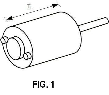
Figure 10.1 — Minimum 3.2 mm (⅛") character height requirement.
The USPTO mandates:
- All characters used in drawings must be at least 3.2 mm (⅛") high
- This corresponds to approximately 12-point text
- The rule applies to numerals, uppercase letters, lowercase letters, and labels
This ensures that printed drawings remain legible even when reduced.
Why All-Caps Are Recommended

Figure 10.2 — All-caps maintain consistent height without oversizing uppercase characters.
Mixed-case text forces the lowercase characters to meet the minimum size, which causes uppercase letters to become excessively large. This creates inconsistent text height and clutter.
Recommended practice:
Use ALL CAPITAL LETTERS for all descriptive labels and text within drawings.
Exceptions for Subscripts and Superscripts

Figure 10.3 — Subscripts and superscripts may be smaller than 3.2 mm.
Superscripts and subscripts may be smaller than the minimum size as long as the main character meets the requirement and readability is preserved.
Characters Used With Symbols

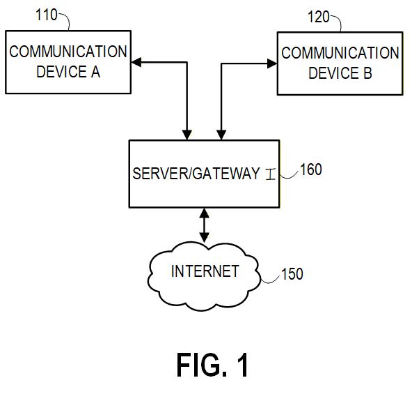
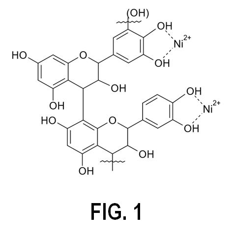
Figure 10.4 — Characters used in formulas, schematics, and block diagrams.
All characters appearing in:
- chemical formulas
- mathematical expressions
- block diagrams
- schematics
- waveform labels
- axes of graphs
must still meet the minimum character size rule.
Placement and Readability Standards
Characters must be:
- clearly separated from object lines
- free of touching or overlapping with hatching, edges, or connectors
- placed consistently across all sheets
- kept inside the drawing margins
- horizontally oriented unless the sheet is landscape
Good spacing prevents USPTO objections related to legibility.
Character Style (Font Requirements)

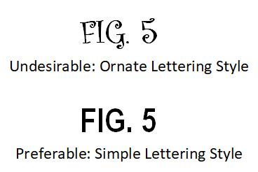
Figure 10.5 — Preferable simple lettering style or font; ornate or stylized fonts are not acceptable.
The USPTO requires that all text in drawings be written in a simple, clear, non-ornate style.
Requirements:
- Use a plain, block-style font (similar to Arial, Helvetica, Calibri, or a simple CAD font).
- Avoid fancy, decorative, script, gothic, or stylized lettering.
- Avoid any font that could introduce ambiguity or be misread when reduced.
- Figure numbers must follow the same simple style (e.g., FIG. 2, not 𝔉𝔦𝔤. 𝟚).
Ornamental or calligraphic fonts reduce clarity and may cause USPTO objections because characters must remain readable under photocopying, scanning, and high reduction ratios.
Summary
- Minimum size: 3.2 mm (⅛″) for all characters
- All-caps recommended: Ensures consistent height across all text
- Superscripts/subscripts: May be smaller but must remain readable
- Simple fonts only: Avoid stylized or ornate lettering
- Placement: Text must never overlap lines, hatching, or symbols
Following these character size and style standards ensures USPTO-compliant, clear, and professionally prepared drawings.